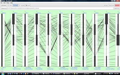
The graphic above summarizes U.S. crime rates from 1960 through 2006, inclusive. The columns are defined as follows from left to right: year, overall crime rate, violent crime rate, property crime rate, murder rate, rape rate, robbery rate, assault rate, burglary rate, larceny rate, and vehicle theft rate.
Overall, this shows that property crime rates have steadily trended upwards in the U.S. since 1960 and that violent crime rates, although trending upwards since 1960, spiked in the 1970s, continued at high rates in the 1980s, and decreased from these higher levels since the 1980s.
When law enforcement agencies want to trumpet their successes in driving down crime, 1970 is the appropriate base year to select and violent crime is the category of crime to select in order to achieve maximum impact. In part, the highly touted “success” of NYPD can be explained by this phenomenon (and not wholly the impacts of “broken windows” and community policing efforts).
[The graphic was created using Parvis (see http://home.subnet.at/flo/mv/parvis/ ).]

![Reblog this post [with Zemanta]](http://img.zemanta.com/reblog_e.png?x-id=a4456b8c-486c-4e7e-9970-ba4c7a1e2655)
See also http://pricetheory.uchicago.edu/levitt/Papers/LevittUnderstandingWhyCrime2004.pdf .